The following draws from scholarship about the most impactful formats for presentations that help students learn.
- How much presentation do you need? Generally speaking, a slide is only helpful if it will:
- Introduce important concepts or complex material.
- Involve an image that you will concurrently narrate with lecture.
- Highlight a brief, important quote that you will either unpack or expand upon with your lecture.
- Present information that cannot be easily explained.
- Connect to content from a previous or upcoming slide.
If a slide does not meet one or more of these criteria, consider using another medium (Niemer, 2014).
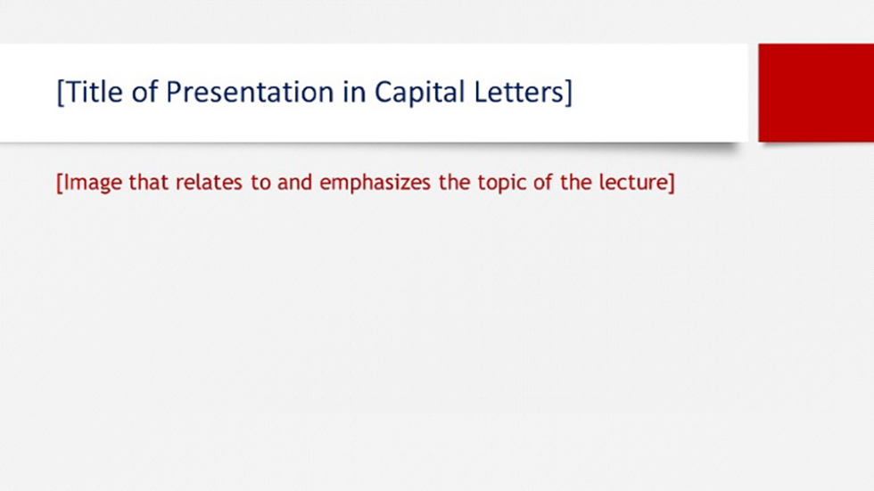
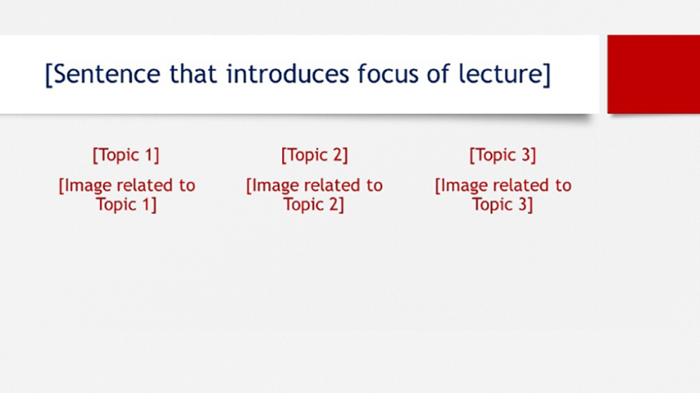
- Initial slides may provide a brief, bulleted outline of the lecture and define important concepts.
- Further slides should fall into one of several categories (Garner & Alley, 2013, 2016; Mayer, 2014; Overson, 2014):
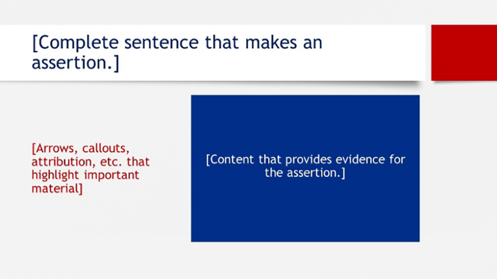
- Evidence toward an assertion slides present an assertion (either at the top of the slide or verbally) with a graphic that explains that assertion. The graphic is then described and explained in detail verbally.
- Slides that signal key concepts or define key terms. This may be done by pulling out a quotation or definition, setting it off with a box, an arrow, or change in text color, and spending time unpacking meaning.
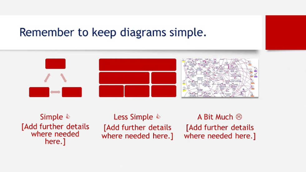
- Regardless of the type of slide, the content should be kept simple (Mayer, 2014; Overson, 2014):
- Slides should not be verbatim repetition of lecture content.
- Graphics should be easy to read, without too many complex components.
- All slides should present the content in a simplified manner, reducing effort needed to connect lecture to the visual aid.
- Narration should reference and draw from the slides immediately present, as though you are in conversation with the presentation.
- General advice on slide legibility:
- Maintain similar text formatting throughout the presentation, unless you are highlighting important material.
- Sans serif fonts are easier to read than serif fonts.
- Use appropriate capitalization.
- Fonts should be no smaller than 18-point to be legible or 24-point if you are providing definitions/quotes.
- Use colors that are on opposite ends of the color spectrum/starkly contrast each other. Avoid combinations that may be difficult for students with colorblindness to see as they are similar in hue or spectrum location (i.e. Green & Red; Green & Brown; Blue & Purple; Green & Blue; Light Green & Yellow; Blue & Grey; Green & Grey; Green & Black).
Examples of slides that apply these principles
Adapted from www.assertion-evidence.com.


